
What Sender Health is
Sender Health is one dashboard that answers a simple question: are my senders working, and which ones need me?
It has two levels. The fleet view lists every LinkedIn sender in one table, so you can scan status, activity, and seat at a glance. Open any sender for a deep dive with up to four tabs — Overview, Activities, Leads, and Health — showing that sender's activity, messaging performance, funnel, persona fit, and schedule.
The fleet list refreshes itself in real time, so status, counters, and seat stay current without a page reload.
When to use it
Open Sender Health when you want to:
- Check that all your senders are running, not stalled or blocked.
- Spot a sender that needs attention before it hurts your results.
- See if a day was slow because of your setup or because LinkedIn hit its limit.
- Understand a sender's funnel: connections, replies, and closed deals.
- Read acceptance rate and reply rate the right way, and compare campaigns.
- Check which personas your leads match and how strong the fit is.
- Confirm a sender's warm-up state and working hours.
The fleet view — all senders in one table
The table lists every sender, one per row. Each row shows the sender's profile picture, name, and city.
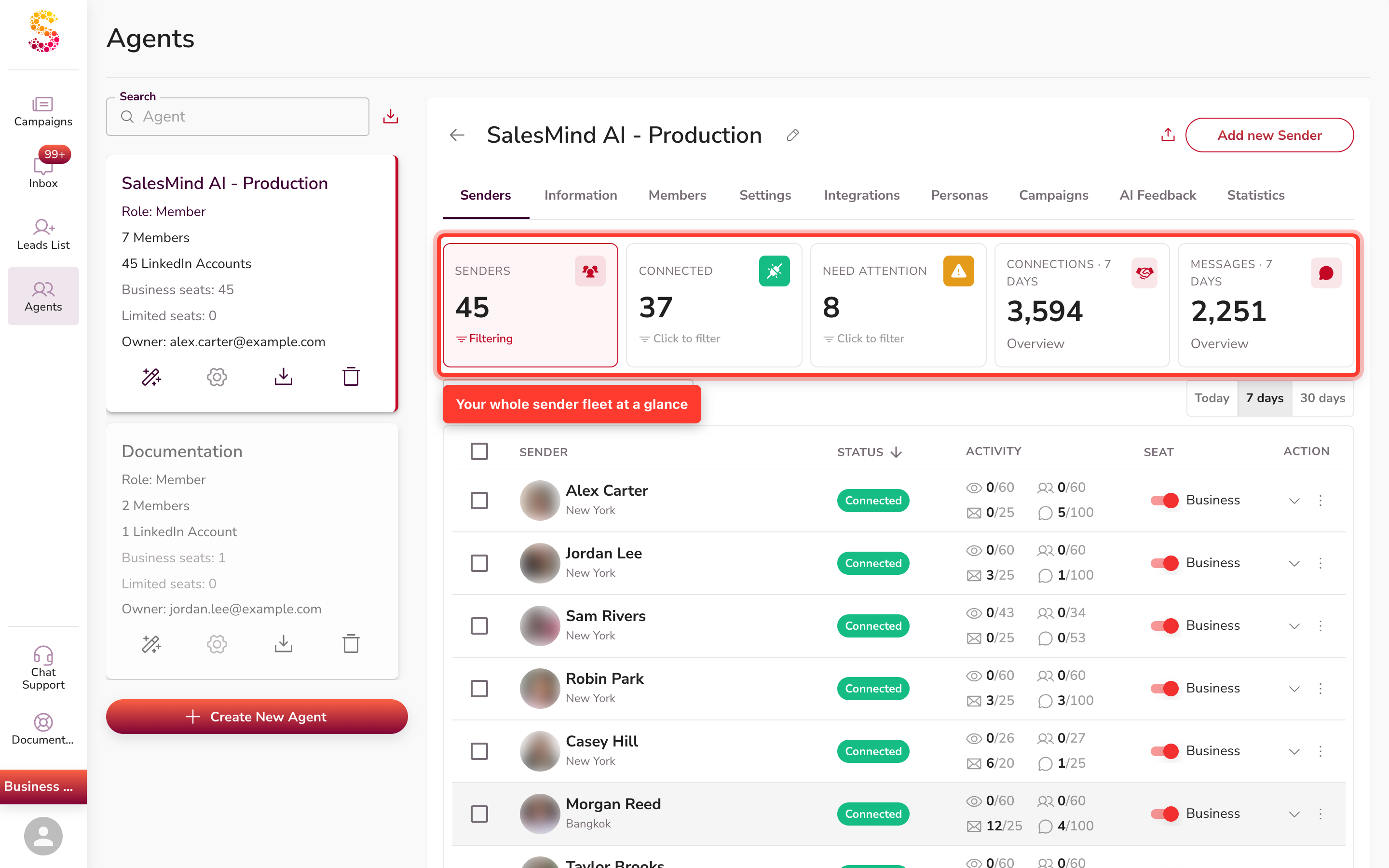
The table shows these columns:
- Sender — the profile picture, name, and city.
- Status — a connection chip, for example Connected or Disconnected, or another state when it needs attention.
- Activity — a compact count of visits, follows, connections, and messages.
- Seat — the LinkedIn plan, shown as Business or Limited.
- Action — expand the row or open its menu.
Leads and acceptance data aren't columns here — you'll find each sender's leads and runway on its detail cards, and its acceptance rate in the Messaging engine (both covered below).
Status indicator — what the dot colours mean
Each sender's name has a small coloured dot that shows their connection status at a glance:
| Dot colour | What it means | What to do |
|---|---|---|
| Green | Connected — the sender is active | Nothing needed |
| Purple / deep magenta | Connecting — a reconnect is in progress | Wait a moment; if it stays purple, log out and back in |
| Red | Disconnected — the session is lost | Reconnect the account (see below) |
| Amber / yellow | Seat inactive or no active campaigns | Check the sender's campaigns or seat status |
The purple dot means a reconnect is in progress, not that the account is deactivated. If the dot stays purple for more than a few minutes, the reconnect may have stalled — log the sender out and back in to restart it.
There is no "Connected Accounts" section in the app. If a sender shows a red dot, go to that sender's campaign detail view — a "Reconnect my account" button appears at the top when you open it. Click that to restore the connection.
For help with accounts that disconnect repeatedly, see the related article on reconnection troubleshooting.
Senders that need attention
A sender's state shows as a labelled Status chip in the Status column. A healthy sender reads Connected in green. When a sender needs you, the chip changes — for example to Disconnected — so you can spot it at a glance. An attention row also shows a thin red left-border accent down the row, beside the Status chip.
To focus the list, use the summary cards above the table. Senders, Connected, Need attention, Connections · 7 days, and Messages · 7 days each show a count. Click the Connected or Need attention card to filter the table to just those senders; the active card shows Filtering. You can also type in the Search senders box, or switch the activity window with the Today / 7 days / 30 days toggle.
The per-sender deep dive — up to four tabs
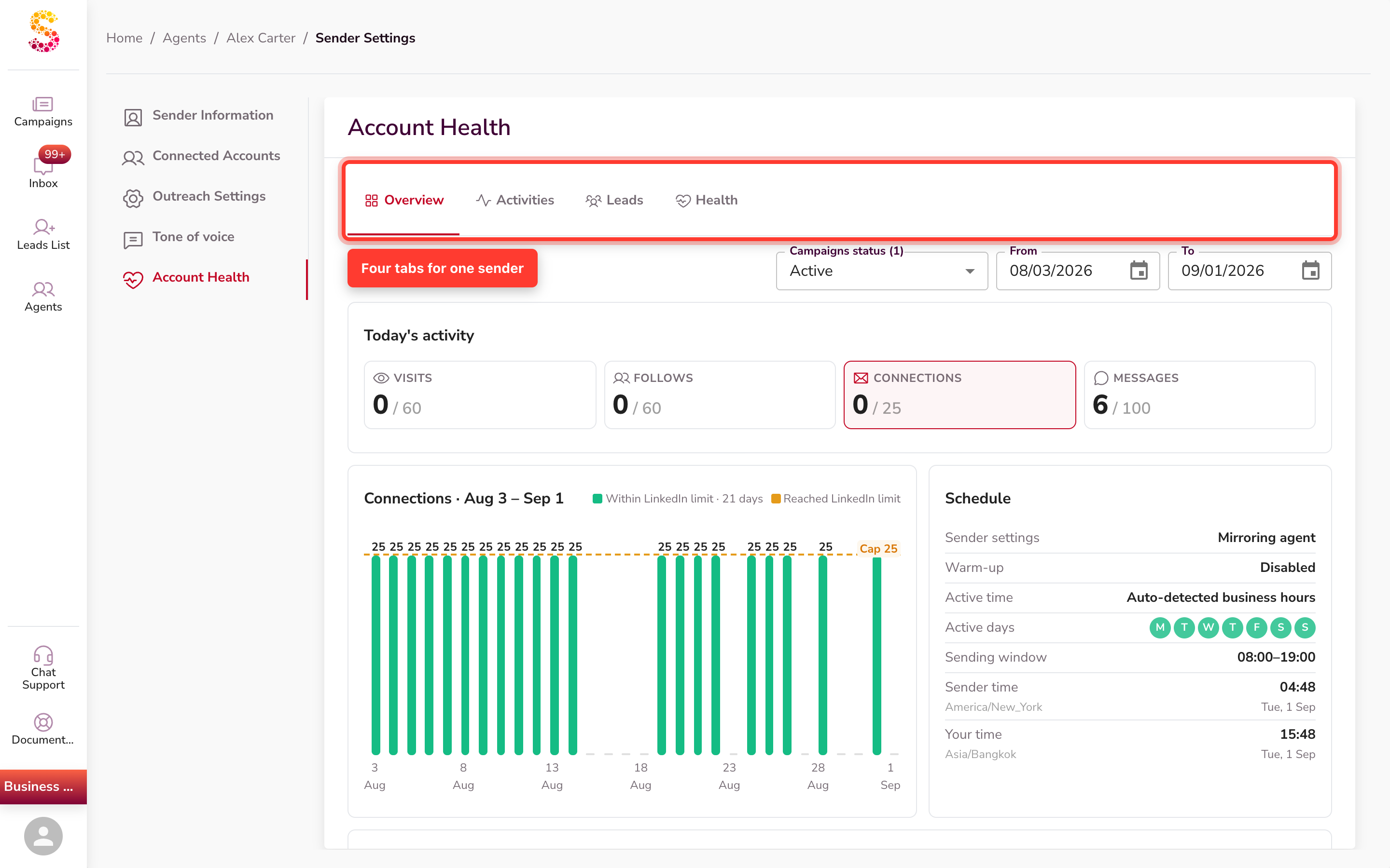
Expand a sender's row and open View full account health to reach its Account Health page. It has up to four tabs:
- Overview — the sender's status headline, Today's activity, a per-day connections chart, the Schedule card, and the Messaging engine.
- Activities — the sender's activity feed, action by action.
- Leads — the Conversation funnel and Persona fit.
- Health — the status headline, Schedule card, timeline, and an audit card.
Activity and messaging (Overview tab)
The Overview tab gives you two ways to read how a sender is doing.
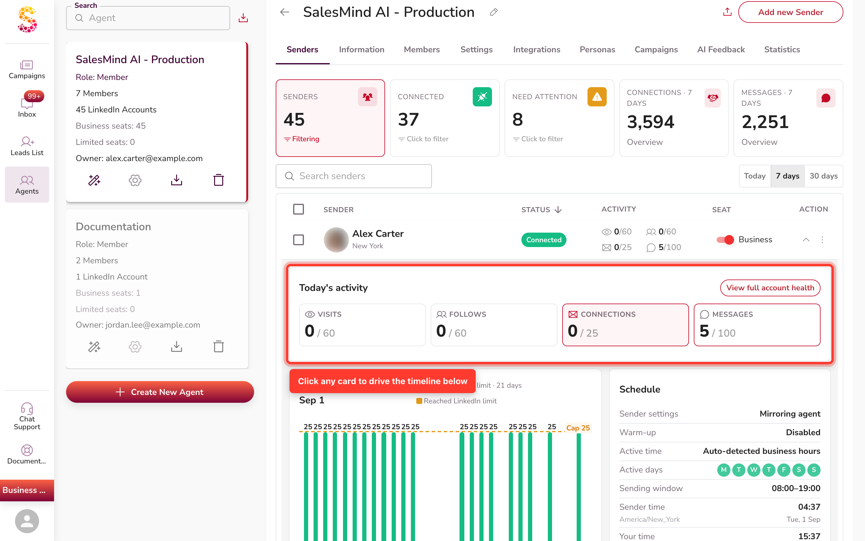
Today's activity and the timeline
The Today's activity block shows four cards — Visits, Follows, Connections, and Messages. Click any card to drive the timeline chart right below it, so the chart plots whatever you picked. Connections is selected by default.
The messaging engine
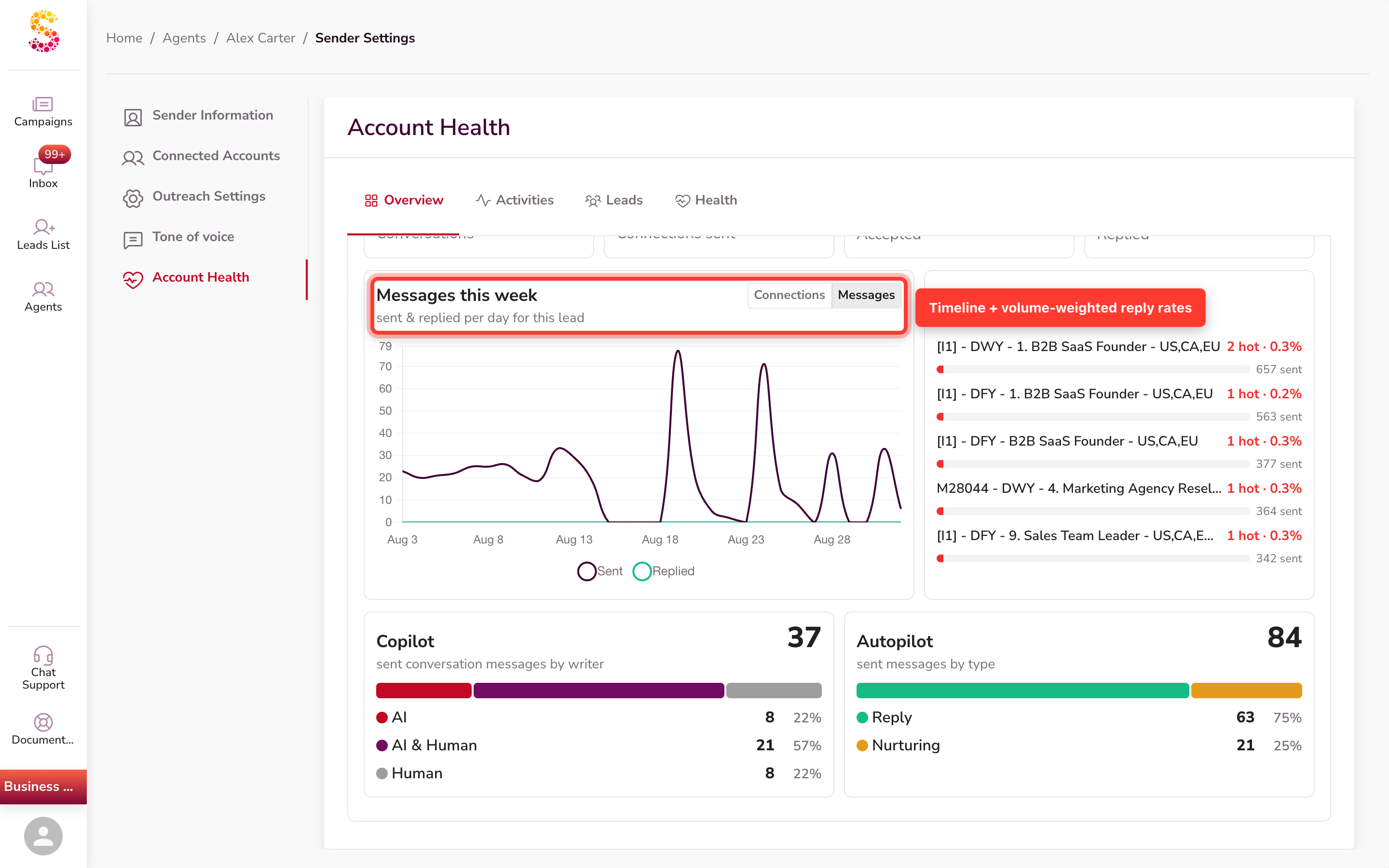
The Messaging engine section measures how your outreach turns into conversations. Its KPI cards are Conversations, Connections sent, Accepted (with a % accepted caption), and Replied (with a % reply rate caption).
A separate Messages this week chart plots activity over time — toggle between Connections and Messages to compare what was Sent and what was Replied. A Top campaigns panel ranks your campaigns by hot leads, and Copilot and Autopilot breakdowns show how those messages were written.
How reply rate is calculated
Reply rate is replied ÷ accepted connections. Because the denominator is real outreach volume, a single reply against one message no longer trivially reads as 100%. This gives you a reply rate you can trust and compare across senders.
The conversation funnel (Leads tab)
On the Leads tab, the Conversation funnel ("per conversation") shows three blocks.
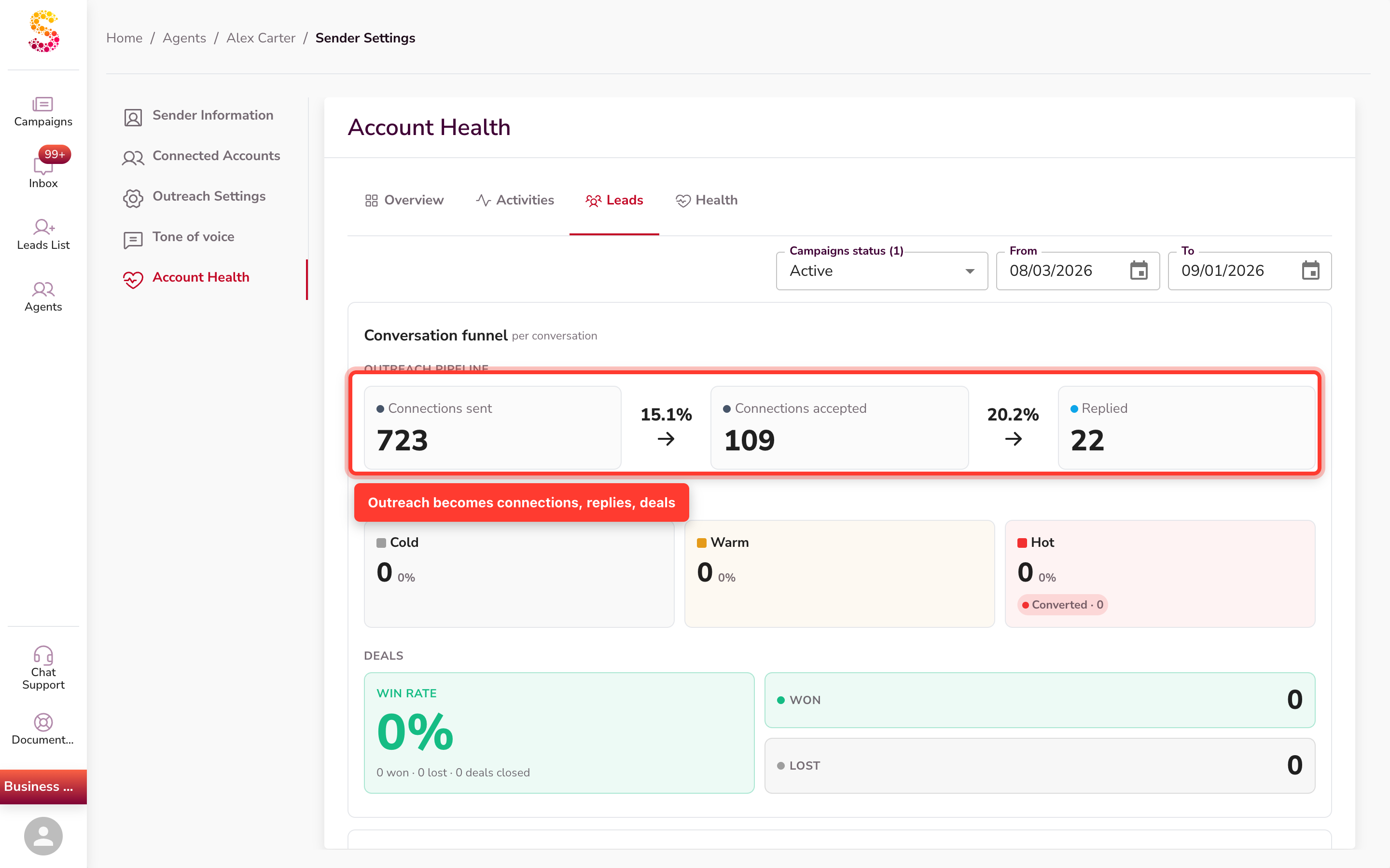
- Outreach pipeline — Connections sent → Connections accepted → Replied, with the conversion rate between each step.
- Reply outcomes — replies split into Cold, Warm, and Hot. Each temperature shows its share of tagged leads (all cold + warm + hot together), not a share of replies. The Hot tile also shows a Converted count — the hot leads that opened a deal.
- Deals — a Win rate figure (won ÷ won + lost), with Won and Lost tiles beside it.
The Overview tab also carries a compact Conversation summary — connections sent, accepted, converted, won, and lost — with the full funnel living here on the Leads tab.
Persona fit (Leads tab)
The Persona fit panel ("Persona reach & fit-score distribution") also lives on the Leads tab and shows how well your leads match your ideal customer profile.
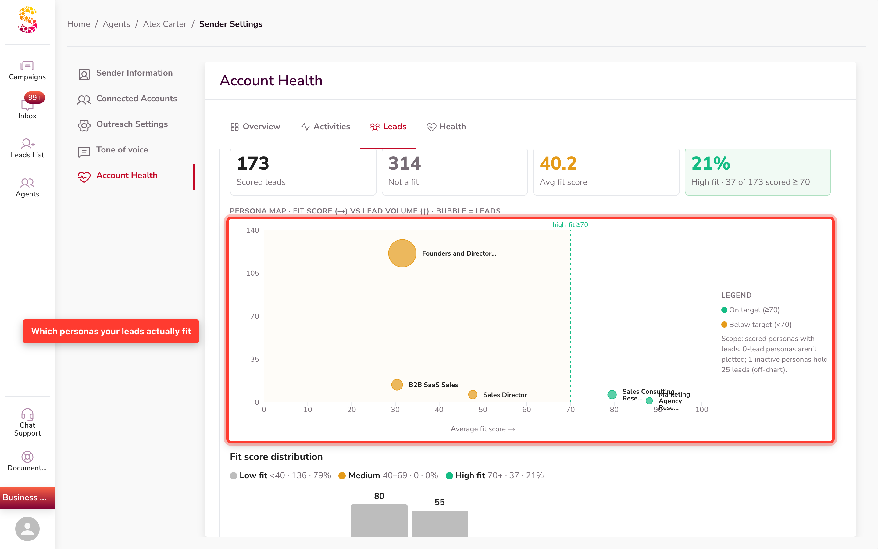
- Fit score — each scored lead gets a score from 0 to 100. Leads scored 0 ("Not a fit") are excluded and counted separately.
- Summary tiles — Scored leads, Not a fit, Avg fit score, and how many are High fit.
- Persona map — a bubble chart of fit score against lead volume, split into On target (≥70) and Below target (<70).
- Band legend + distribution — a thin Low fit / Medium / High fit legend sits just above a histogram that spreads scored leads across the 0–100 range. The legend labels the bands — Low fit (under 40), Medium (40–69), and High fit (70+) — each with its share.
The persona detail (band legend, histogram, map, and table) appears only once the sender has scored leads. Until then, you'll see a "No scored leads yet" empty state.
Click a persona row in the Personas table to filter the view to just that persona: the band legend, histogram, and persona map all update in place to show only that persona's data. It doesn't open a separate lead list — it re-scopes the charts you're already looking at. Less-used personas fold into an expandable Inactive personas row.
LinkedIn limit awareness
On the Overview connections chart, days when the sender reached LinkedIn's connection limit show in amber instead of green. The legend reads "Reached LinkedIn limit · N days" next to "Within LinkedIn limit · N days."
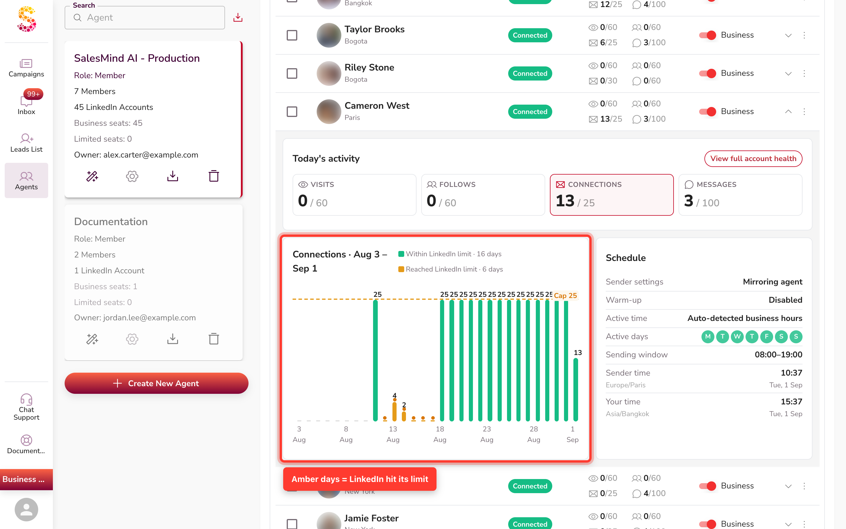
Each bar is coloured on its own: a day is amber only when the sender hit LinkedIn's connection limit that day. If a sender is at its cap every day, every bar is legitimately amber — that's not a bug, it's the platform's ceiling. Amber tells you LinkedIn stopped the sender, not that your setup is slow, so you know when there's nothing to fix.
If a sender reaches LinkedIn's limit about four days in a row, we recommend turning warm-up back on at a gentle warm pace. Warm-up eases the sender's activity down a little, which helps its connection requests start going out again. See How to Warm Up Your LinkedIn Account for the steps.
Warm-up and schedule at a glance
To see a sender's schedule, expand its row in the fleet view — use the Expand sender chevron in the Action column. The Schedule card opens in the expanded panel (it's also mirrored on the deep-dive Overview tab). It shows how and when each sender works:
- Sender settings — Mirroring agent or Own settings.
- Warm-up — Enabled or Disabled; when on, a Warm-up speed of Cold, Warm, or Hot.
- Active time — Auto-detected business hours or Custom schedule.
- Active days and Sending window.
- Sender time and Your time — two live clocks, so you see the sender's working hours in its own timezone and in yours.
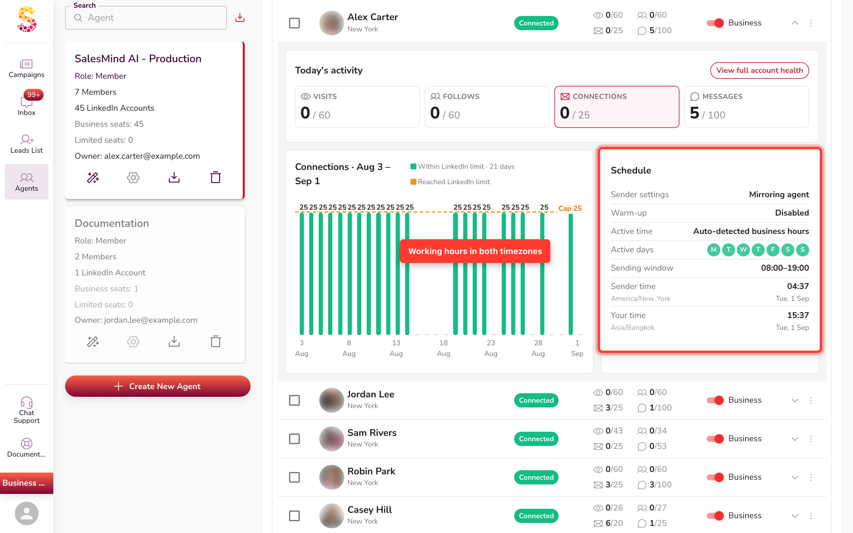
When the Sender settings row reads Mirroring agent, that sender takes its setup from its agent rather than its own settings.
Live updates
The fleet list updates itself in real time. Status, activity counters, and seat refresh on their own as the sender works — no reload needed.
The detail charts (funnel, persona fit, messaging engine) don't stream live. They refresh when you open or revisit a sender, so reopen a tab to pull the latest numbers there.
Things to know
- Sender Health is read-only. It shows how your senders are doing; you change schedules, warm-up, and targeting in your agent and campaign settings.
- Cold/Warm/Hot are a share of tagged leads, not a share of replies — so the three shares add up across all tagged leads.
- Amber days are LinkedIn's limit, not a problem to fix. Don't change your setup based on throttled days alone. If a sender hits the limit about four days running, switch warm-up back on at a warm pace to ease it back into sending.
- Only the fleet list is live. Detail charts refresh on navigation, so reopen a sender for its latest figures.
- There is no "Connected Accounts" section. If you need to reconnect a sender, open their campaign detail view — the "Reconnect my account" button appears at the top.
FAQ
What does the purple circle next to my sender's name mean?
It means a reconnect is in progress — the account is in a connecting state. This is normal if someone just clicked "Reconnect my account." If the dot stays purple for more than a few minutes, the reconnect may have stalled. Log the sender out and back in to restart it.
What does each colour of the dot next to my sender's name mean?
Green means connected and active. Purple/deep magenta means a reconnect is in progress. Red means the session is lost and action is needed. Amber means the seat is inactive or there are no active campaigns.
Where is "Connected Accounts"? I can't find it.
There is no "Connected Accounts" page in the app. To reconnect a sender, open their campaign detail view — a "Reconnect my account" button appears at the top of that page. Click it to restore the connection.
Can I see how many invites go out each week, and what the real limit is — yours versus LinkedIn's?
Open a sender and check the Messaging engine on the Overview tab for Connections sent and your % accepted. Then look at the connections chart on the same tab: days where the sender reached LinkedIn's limit show in amber with a "Reached LinkedIn limit" count, so you can tell the platform's ceiling from your own settings.
How do I stop a sender from sending on weekends so it doesn't go over my weekly LinkedIn limit?
Expand the sender in the fleet view and check the Schedule card — it shows the Active days and Sending window in use. If the Sender settings row reads Mirroring agent, the schedule comes from the agent, so change the days in your agent's settings. Sender Health shows the schedule; you edit it there.
My campaign feels stuck — is that LinkedIn's limits, a technical issue, or something on my account?
Start with the sender's Status in the fleet view. A chip like Disconnected — or another attention state — tells you the cause at a glance. For the full troubleshooting path, see the related articles on why a campaign isn't running.
My reply rate looks different since the last update — did the calculation change?
Yes. Reply rate is now replied ÷ accepted connections, so it reflects real outreach volume. A single reply against one message no longer reads as 100%, which makes reply rate reliable and fair to compare across senders.